Friday, February 19, 2010
Thursday, December 10, 2009
Tutsplus
The Tutsplus network is pretty awesome. Here's my three favorites.
http://cg.tutsplus.com/
http://ae.tutsplus.com/
http://psd.tutsplus.com/
http://cg.tutsplus.com/
http://ae.tutsplus.com/
http://psd.tutsplus.com/
Monday, December 15, 2008
Paul Del Vecchio
Just thought I'd direct you to Paul's Vimeo page where he has some good tutorials.
Paul Del Vecchio's page
check it out!
Paul Del Vecchio's page
check it out!
Tuesday, November 25, 2008
Star Trek Enterprise shot is bothering me.
OK, I'm posting this here, because it can loosely be interpreted as a tip.
I love the new Star Trek trailer. I'm really looking forward to the movie. However, there is one shot that is bothering me. It's the shot of the Enterprise being built. No, I'm not a Trekkie who has some issue with a change in design or anything like that. My problem is that I don't feel like I'm seeing something real.
Here's the shot in question.
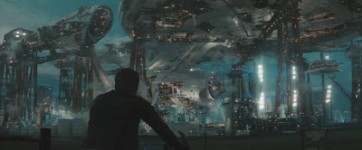 This is a screen grab from the trailer. When I see this shot, I feel like he's riding his bike up to a big painting. Part of this is because it's all in perfect focus. But also, I think it's because it doesn't feel big enough. This thing should be massive, but feels like it's about the size of a Macy's Parade balloon. That thing's details should be barely visible through the atmospheric haze, if you ask me.
So I did some quick touch-ups to the pic, and came up with this, which I feel emphasizes the sense of enormity that it should bring to the viewer. Let me know if you think I'm right or wrong.
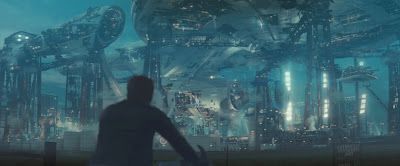
EDIT: I just did a rough After Effects comp to try and better illustrate my point and I put the shot back into the sequence.
Wednesday, November 19, 2008
easy to make CD/DVD Shader
So, I had to make a shader recently that I realized could be altered to make a few different things. One of those things is a CD/DVD shader, so we'll build one of those here.
I started with a flat disc model and then set up the UVs with a planar projection on the y-axis.
Next I started with the base gold-ish shader.
You want a kind of dark brown for the base color, with a yellowish specular color and low roll off and reflectivity.
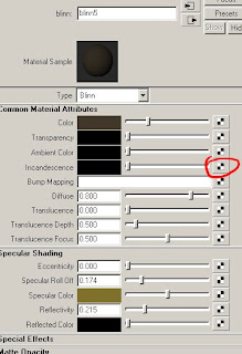
Then we connect another blinn to the incandescence channel. This will be the rainbowy highlights that radiate from the center.
 turn the color to black and map a circular black-to-white ramp to the bump channel.
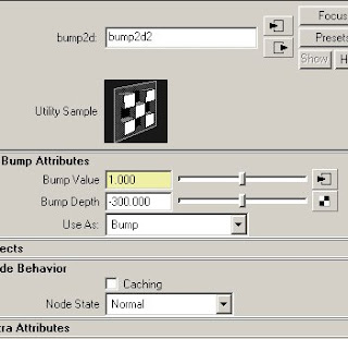
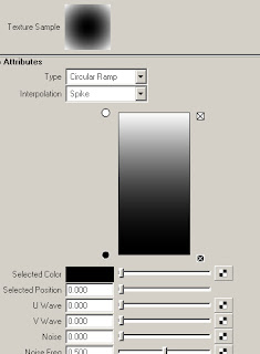 set the bump to a high number. I wound up thinking it looked better as when I put the number in the negative, but you could just invert the black and white instead.
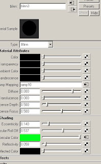
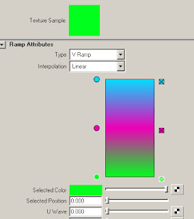
 and finally, we add a colorful ramp to the specular channel and toy with the spec/reflection settings. Also, connect a sampler info node's facing ratio to the vCoord of the ramp. This will make the color change as the normals roll away from the camera.
 Almost forgot, since I was rendering in Mental Ray, I added a tiny amount of reflection blur here. A value somewhere around 3.
I set up a sphere with an HDR to produce some reflections and hit render, and this is what I got.
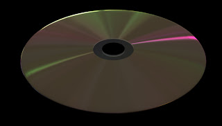 And here's another test I did with it, going for a kind of brushed metal look.

You may not have to make a DVD shader any time soon, but you can adapt this for other looks. Vinyl records. Saucepans. See what you can come up with.
I started with a flat disc model and then set up the UVs with a planar projection on the y-axis.
Next I started with the base gold-ish shader.

You want a kind of dark brown for the base color, with a yellowish specular color and low roll off and reflectivity.
Then we connect another blinn to the incandescence channel. This will be the rainbowy highlights that radiate from the center.
 turn the color to black and map a circular black-to-white ramp to the bump channel.
 set the bump to a high number. I wound up thinking it looked better as when I put the number in the negative, but you could just invert the black and white instead.
 and finally, we add a colorful ramp to the specular channel and toy with the spec/reflection settings. Also, connect a sampler info node's facing ratio to the vCoord of the ramp. This will make the color change as the normals roll away from the camera.
 Almost forgot, since I was rendering in Mental Ray, I added a tiny amount of reflection blur here. A value somewhere around 3.
I set up a sphere with an HDR to produce some reflections and hit render, and this is what I got.
 And here's another test I did with it, going for a kind of brushed metal look.
You may not have to make a DVD shader any time soon, but you can adapt this for other looks. Vinyl records. Saucepans. See what you can come up with.
Wednesday, September 17, 2008
Tips When Digitally Painting
Just some quick tips for when you're doing any digital painting, whether it's for a matte painting or a texture map, or anything else. If I think of any other tips that would fit in here, I'll update the list.
Use A Tablet
It's infinitely easier to paint with a wacom tablet than with a mouse. The ability to use pressure to control your brush size or opacity or any number of other things us crucial.
Color Sampling
I usually have my color sampler (eyedropper) set to 3x3 pixel sampling. It's a great way to get an average color to blend between two colors. This is good for when you need to make softer edges or when creating the wrapping light around curved surfaces.
Unsharp Mask
this is a much better way to sharpen your images and texture maps than just using the standard Sharpen filter.
Embossed Texture Overlay
Sometimes a good way to give something a textured quality is to use a photographic image that is run through the emboss filter, and set the layer to overlay. This is kinda similar to bump mapping in a 3d program.
Desaturate to Check Your Values
I don't often use this, and I probably should use it more, but it can sometimes help to desaturate your image so that you can more clearly see the luminance values of the image.
Light Bounces
When objects get closer to each other, there tends to be bounce light. This is an almost subliminal way to bring realism to the picture.

Friday, August 15, 2008
Relighting with Normals Passes
I recently received an email asking me to put up an old tutorial from my website on relighting with normals passes. This tutorial uses Maya and After Effects, but should be easily transferred to other apps. This technique can be used in conjunction with an occlusion shader to create ambient light, or can be used to add to/alter the diffuse lighting that is already rendered.
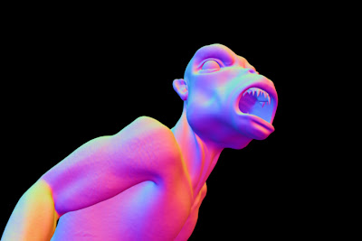
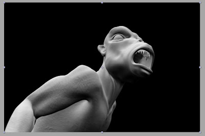
Start off with a normals render light this. I used Mental Ray's occlusion shader to render out the normals.
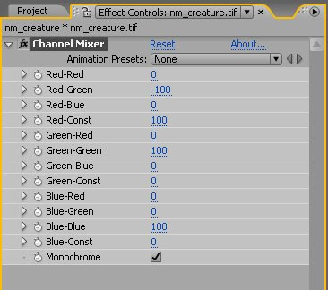
Drag it into a comp and apply a channel mixer effect to it. Set the channel mixer to "monochrome"
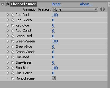
This makes it so that only the top four sliders effect the image. Basically, just take the "Red-" preface off of each slider label.
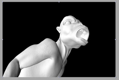
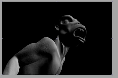
So what you get is a greyscale image based only on the red channel. In the normals pass, Red is the normals value along the X axis, where the more a normal faces the positive X direction, the more red it gets. (note: the x axis can be either the world x or the camera x, depending on the type of normals pass. This pass was done in world space.).
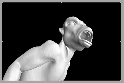
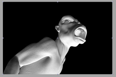
If we turn the red channel down to 0 and the green channel up to 100, we get the Y axis normals, like this.
and the Z axis is of course, blue.
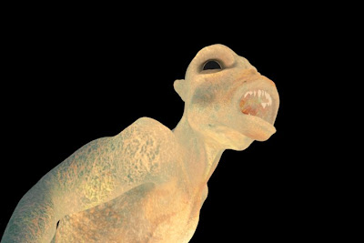
Now, if we set a channel to the negative, we have to compensate with the "constant" channel. Here, we see a negative green channel with compensation.
See how it looks like it's lit from underneath, instead of from above.
So let's play with some sliders. Say I want to create a bit of a side light/rim light. Well, thinking in terms of xyz, I would want the light to come from a little bit behind, so I set the blue (Z) to a negative value. I want the light to be a bit above and to the screen right of the character, so I set the green(Y) and red(X) to a positive value. I don't really need to use the constant slider, because the red and green channels are doing the job of compensating here.
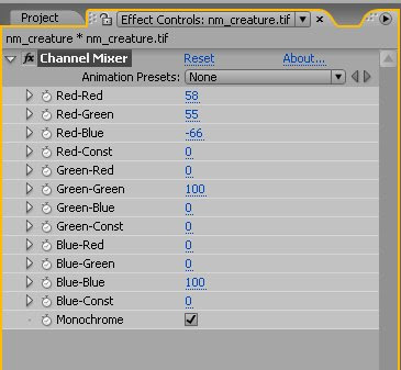
So let's say this is what I want the light to look like.
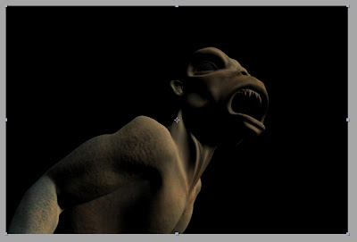
Now I bring in a color pass and multiply it over the normals pass.
and there you go. Basically you have a diffuse render now.
This method has been extremely helpful on a lot of jobs I've done. I've even done some jobs using only normals passes for lighting, and just rendering out shadow and occlusion passes once I'd set up the "lights" how I wanted them. However, there are a few areas that you can get caught up if you're not careful. One of the biggest is premultiplied alphas. The best workaround I've found is to ignore the alphas for the main passes (color, normals, occlusion) and then precomp them together, applying an alpha to the precomp via track matte or the set matte effect.
I hope this helps you out. If you think of any other ways to use the normals, or of a better way to get the same effect, drop me a line or a comment. And if there are any techniques you'd like to see, let me know and I'll see if I can come up with something.
Start off with a normals render light this. I used Mental Ray's occlusion shader to render out the normals.

Drag it into a comp and apply a channel mixer effect to it. Set the channel mixer to "monochrome"

This makes it so that only the top four sliders effect the image. Basically, just take the "Red-" preface off of each slider label.
So what you get is a greyscale image based only on the red channel. In the normals pass, Red is the normals value along the X axis, where the more a normal faces the positive X direction, the more red it gets. (note: the x axis can be either the world x or the camera x, depending on the type of normals pass. This pass was done in world space.).

If we turn the red channel down to 0 and the green channel up to 100, we get the Y axis normals, like this.

and the Z axis is of course, blue.

Now, if we set a channel to the negative, we have to compensate with the "constant" channel. Here, we see a negative green channel with compensation.


See how it looks like it's lit from underneath, instead of from above.
So let's play with some sliders. Say I want to create a bit of a side light/rim light. Well, thinking in terms of xyz, I would want the light to come from a little bit behind, so I set the blue (Z) to a negative value. I want the light to be a bit above and to the screen right of the character, so I set the green(Y) and red(X) to a positive value. I don't really need to use the constant slider, because the red and green channels are doing the job of compensating here.

So let's say this is what I want the light to look like.

Now I bring in a color pass and multiply it over the normals pass.

and there you go. Basically you have a diffuse render now.

This method has been extremely helpful on a lot of jobs I've done. I've even done some jobs using only normals passes for lighting, and just rendering out shadow and occlusion passes once I'd set up the "lights" how I wanted them. However, there are a few areas that you can get caught up if you're not careful. One of the biggest is premultiplied alphas. The best workaround I've found is to ignore the alphas for the main passes (color, normals, occlusion) and then precomp them together, applying an alpha to the precomp via track matte or the set matte effect.
I hope this helps you out. If you think of any other ways to use the normals, or of a better way to get the same effect, drop me a line or a comment. And if there are any techniques you'd like to see, let me know and I'll see if I can come up with something.
Subscribe to:
Posts (Atom)